P9 Portfolio
Project Corrections / Time spent: I corrected/recreated my P2 Ad project which took about five minutes, and also made a few corrections to my montage project for 2 minutes.
Message: This is to showcase what I have learned over the course of my visual communications course.
Audience: Any potential employer that wants to hire me for my visual communication skills.
Top Thing Learned: I learned how to quickly and efficiently make the entire portfolio look uniform using the pages tool on Adobe InDesign.
Future application of Visual Media: I will use the principles that I learned in COMM 130 within my future career in video production.
Color scheme and color names: Analogous color scheme. Colors – Green, Lime and Yellow.
Title Font Name & Category: Lucida Blackletter (Decorative)
Copy Font Name & Category: Minion Pro (Oldstyle)
Thumbnails of Images used: All images used for the pages of this portfolio were created using Adobe InDesign.
P8 Brochure
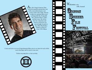
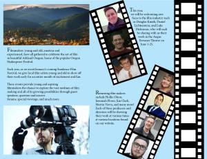
- Description: This is a brochure made for the 10th annual Oregon Summer Film Festival in Ashland Oregon.
- Process (Programs, Tools, Skills): This brochure was made using Adobe InDesign and most of the images used are either from photos of my friends and from independent film makers photos found on line. The text wrap tool was used quite a bit when dealing with the film strip designs both on the back of the brochure and inside the brochure.
- Message: This brochures message is to introduce people to the event and to let them know what to look forward to during the duration of the event. In other words it is meant to get the attendants excited about the coming events.
- Audience: The audience includes aspiring film makers as well as those that are interested in independent filmmakers.
- Top Thing Learned: I learned a lot about how to use the text wrap tool, and how that can be used to make some very interesting visuals when it is done well.
- Color scheme and color names: monochromatic, blue
- Title Font Name & Category: Rosewood Std. (Decorative)
- Copy Font Name & Category: Minion Pro (oldstyle)
- Word Count of copy: 271
- Thumbnails of Images used:


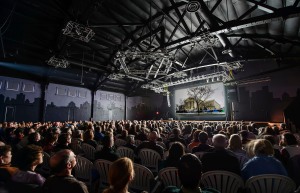


- Sources (Links to images on original websites)http://www.lightwayschools.org/resources/ashland.jpg?timestamp=1409254780984http://media.timeout.com/images/101549629/320/240/image.jpghttp://static.parade.condenast.com/wp-content/uploads/2014/04/film-fests-ashland-film-festival1.jpghttp://blog.nfb.ca/wp-content/uploads/2011/01/filmmaker-cropped-435×290.jpghttp://www.hollieolson.com/uploads/8/7/9/1/8791162/7498182.jpghttp://iliveherepdx.com/wp-content/uploads/2011/12/vavra.jpghttps://media.licdn.com/mpr/mpr/shrink_500_500/p/6/000/2bd/085/352ab59.jpg
https://pbs.twimg.com/profile_images/378800000769229389/170f4d15a6eb72a274ad20e9774dfdb5.jpeg
P7 Webpage
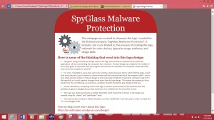
Description: This is a Web page design made for the logo previously designed for “SpyGlass Maleware Protection” during my Logos project. (P5) This showcases what the logo would look like when placed in a web page for the company it was made for.
Process (Programs, Tools, Skills): The Logo was made in Adobe Illustrator, but the design for the web page itself was made using html and css coding.
Message: The message of this web page is to promote the SpyGlass software logo and what thinking went behind each design.
Audience: The audience would include those potential employers who are looking for a new innovative design for their company. This web page is made to pitch the idea of the new logo to those people.
Top Thing Learned: This project was surprisingly very enjoyable for me to work on. I was unaware of how many things that you could design using only code. Once I became familiar with it, what I could do with it and what the mediums limitations were, I was able to explore my options and make a professional looking web page. It became easier the further I explored the medium.
Color scheme and color hex(s): I chose a monochromatic color scheme: red.
Title Font Families & Category: Droid Sans (Oldstyle)
Copy Font Families & Category: Calibri (Sans Serif)
Changes made to the CSS: I changed each color code, and each font category I rounded the edges of the body and the heading, and I made the image float left. I also changes the size of the border around the body.
Word Count: 307
P6 Stationary
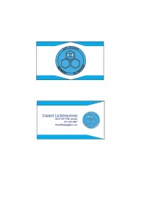
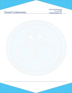
Description: This is an example of business cards and a memo sheet that one might use when working for Spy Glass Malware Protection.
Process (Programs, Tools, Skills): I used Adobe Illustrator to design the logo and Adobe InDesign for the rest of the stationary.
Message: The message is a very professional and business-like appearance.
Audience: Customers and Employees of Spy Glass Malware Protection
Top Thing Learned: The first thing that I learned from this is that the use of white space is very important. I had trouble giving the project enough white space when it came to designing the business cards. The main problem was that I had tried to squish elements together a little too much and had to spread them out a lot more than I previously had before.
Color scheme and color names: Monochromatic – Blue
Title Font Name & Category: Lucida Bright (Modern)
Copy Font Name & Category: Minion Pro (Oldstyle)
P5 Logos
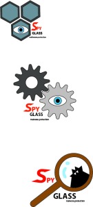
Description: This is a series of logos made for the Spy Glass malware protection company. Potentially one of these three logos would show up as a desktop logo for the programs that Spy Glass distributes in order to protect the buyer’s computer from harmful viruses.
Process (Programs, Tools, Skills): I mainly used the shape too on Adobe Illustrator as well as the Pathfinder tool for several of the images.
Message: The main message of each of the logos is that the program will look after the important features on the computer and watch out for viruses that could harm the computer in any way.
Audience: The audience is mainly for any individual that either owns or is looking to buy a computer and needs to feel secure in their investment.
Top Thing Learned: The main thing that I learned from this project was that the design need not be too complicated in order to convey the proper message to it’s assigned audience.
Three Color Scheme and Color Names:
Design #2: Complimentary – red, blue, and grey
Design #3: Split Complimentary – red, brown, black, and light blue
Design #1: Complimentary – red, blue, and grey
Three sets of Title / Body Font Names & Categories: Myriad Pro (regular and bold) Sans Serif for all designs.
Votes on favorite logo: Top Logo = 3 Middle Logo = 1 Bottom Logo = 2
My favorite logo is the middle Logo.
P4 Montage
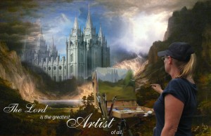
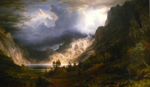
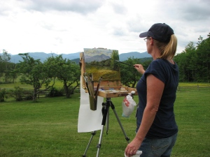
Description: this is an image is of an artist in the middle of a dramatic landscape, drawing what she sees. In place of the mountains, she sees the image of the Salt lake temple and paints it as she sees it.
Process (Programs, Tools, Skills, Steps taken while designing): The image was created using the masking tool on Photoshop.
Message: The message is to look at nature and be inspired by the handiwork of the Lord in everything you see. It depicts art as a holy work, and that everything the Lord has created is artwork.
Audience: this image is aimed towards the LDS community, and also the artist community.
Top Thing Learned: Using the Masking tool was very fun for me. I learned much more about how to use symbolism through Photoshop during this activity than the last. Using the masking tool, I was able to learn about how to fade pictures into each other, so much that they don’t even look like they were separate to begin with.
Filter / Colorization used and where it was applied: There were no filters or colorizations used on any of these images.
Title Font Name & Category: (Script)
Copy Font Name & Category: Myriad Pro Italicized (Sans Serif)
Thumbnails of Images used:
P3 Photo Design
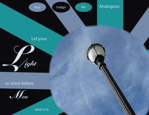
Description: This is a Photoshop color design that uses an analogous color scheme from the photo provided.
Process (Programs, Tools, Skills): The design was made using a digital camera for the photo, putting it through Photoshop twice and selecting the color pallet from within the photo itself to make the rest of the design.
Message: The main theme of the piece is “Let your light so shine before Men” and is meant to remind Followers of Christ to not hide their testimonies.
Audience: Mainly to members of Christian denominations, regardless of age demographic
Top Thing Learned: I learned that working with Photoshop can produce some very real special effects as well as special effects that bring down the whole quality of the photo. It can be tricky at times to remember what layer effects what part of the photo, and how much of a difference each layer makes in the whole scheme of the project itself.
Color scheme and color names: Analogous Color scheme: Blue, Teal and Indigo
Title Font Name & Category:(Script)
Copy Font Name & Category: Meiryo (Sans Serif)
Thumbnail of original, unedited image inserted

Photo taken on Tuesday October 14, 2014 on the BYU-Idaho campus between the Spori building and the Library.
P2 Ad
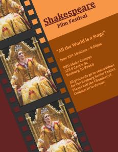
Description: This is an ad for a Shakespeare Film Festival at the BYU-Idaho Campus. All proceeds for the event go to the Chamber of Commerce.
Process (Programs, Tools, Skills): Everything used in this project was put together using Microsoft Word. The segments of color used, including all of the tiny squares used to make the film strip edges, were used with the square shape tool provided in the word program. The photo used was scanned from a Playbill and then positioned to make the frames in the film strip.
Message: The message of this ad is a cultured and fun-filled event for all ages that gives back to the community.
Audience: The audience mostly consists of students from BYU-Idaho, but is also aimed towards the general public.
Color scheme and color names: Black Text 1 for the film strip design, and Red Accent 2 Darker 50%, Orange Accent 2 Darker 50%, and Orange Accent 6 for the rest of the ad.
Top Thing Learned: I learned how to use Microsoft Word to design projects both on a Mac and a PC.
Title Font Name & Category: Cambria (Old style)
Copy Font Name & Category: Cambria (Old style)
Scanned images used, sources, original sizes, location of scanner used: Image scanned from the Oregon Shakespeare Festival Playbill 2014, originally 4.26 by 6.27 inches, scanned by an EPSON Perfection V500 PHOTO
P1 Flier
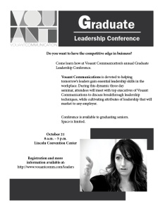
Description: This is a design made for the Vouant Communications Graduate Leadership Conference.
Process: The flier was made solely using InDesign, using the text and photos provided from byui.edu.
Message: a pathway to success for graduating students. By attending this seminar, the graduating class will gain the skills needed to be future leaders.
Audience: Graduating students, and all students who wish to get ahead in life.
Top thing Learned: The main thing that I learned during this project was how to make the design look professional while at the same time making it interesting to look at.
Title Font: Franklin Gothic (Sans serif)
Copy Font: Minion Pro (Old style)
Links to Images used:
Logo: https://130.commbyui.org/wp-content/uploads/2013/01/VouantLogo3.png
Photo: https://130.commbyui.org/wp-content/uploads/2013/01/JuliePeterson-Leadership-conference-business-rexburg-Idaho_7645-as-Smart-Object-11.jpg

Check this one out http://lindseyannjohnson.wordpress.com/2014/10/05/project-1-flier/comment-page-1/#comment-6
Dan, there are so many things that really impressed me with your project. I like the spacing of your text in a staggering style. Also I like the logo on the upper left hand corner. It is something that makes your flier stand out more so than any other students from our class. Finally I really think you did an excellent job in the overall design of your project, and it really stands out.
svcall.wordpress.com
I absolutely love the design of this flier! You did a great job at displaying the skills you have developed using Adobe Indesign with this project. I love how you inserted the picture in the corner over solid colored shapes; it really helped the contrast on the flier. There is also a reasonable amount of white space used; not too much, but not too little either. The flier is well balanced and looks appeasing to the eye. Wonderful Job!
http://mitchcomm.wordpress.com/
Your montage project works really well! The concept and images all flowed together. The quote brought the perfect gestalt to the overall design. The blurred effects were gradual and really well done. I could see this as a Mormon Ad in the Ensign magazine! The way you edited the painting the woman was doing was very smart and a cool added effect!
Here’s another montage project I liked: https://channingrose.wordpress.com/
I love your montage! It’s a really interesting concept you put together with the three images and it looks great. The picture goes really well with the message and it’s a really inspiring quote that you used. Great job! Check out my project from this week http://madicomm130.wordpress.com/
Ok I love your logos! I really like the second and third logo. I love the fun use of the gears and magnifying glass that you used. Where you placed your text on your last logo is amazing! I love how on your last logo, you used the magnifying glass to create a glare, but you made it look like the letter i as well. Such a cool idea! It’s like i-Spy! Anyways, overall I really liked all of your logos! They are just great!
Also here’s a link to my logos! https://channingrose.wordpress.com/2014/11/01/project-5-logos/
I really like your event ad! The color scheme definitely has a Shakespeare feel. I like how you tilted everything at an angle. It worked really well.
Check mine out! http://kenzieleighmaynard.wordpress.com